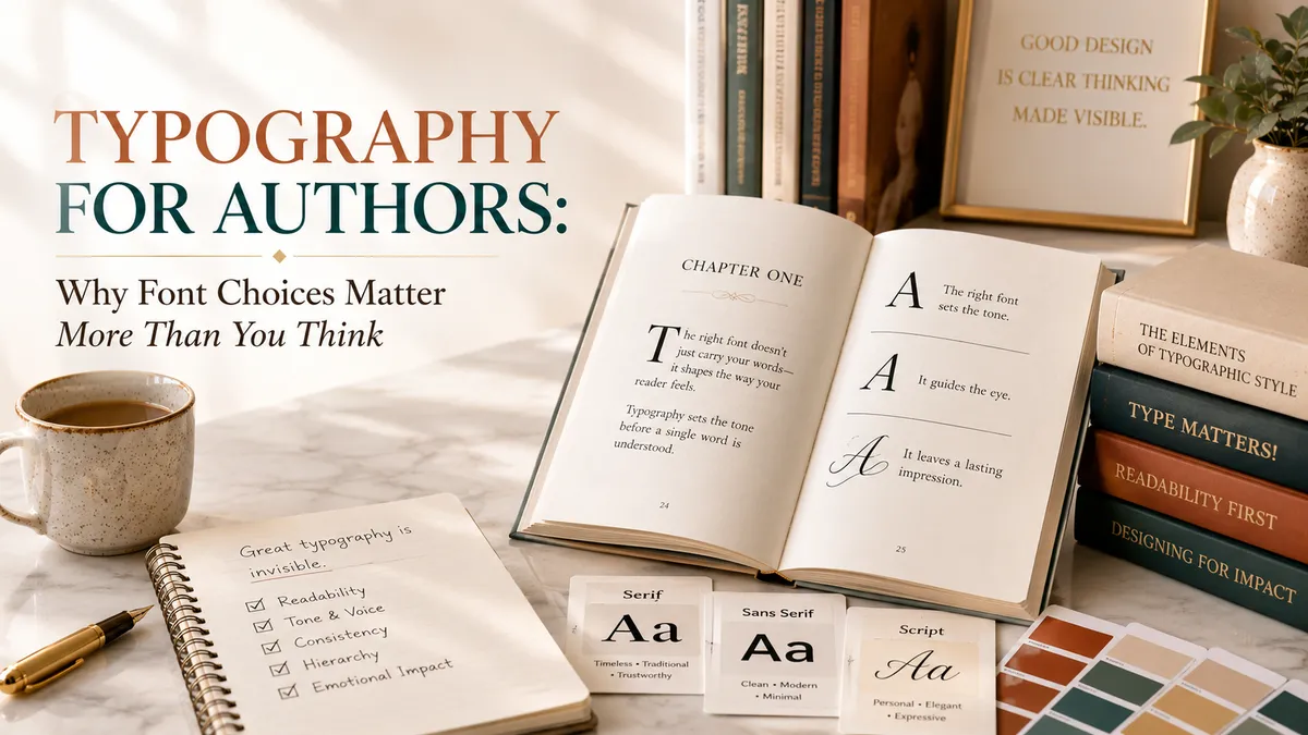
Book Typography: A Guide for First-Time Authors
Most readers will never consciously think about the font used in the book they’re holding. That’s actually the point — and it’s exactly why typography deserves more attention from authors than it usually gets. The letters carrying your message are doing enormous invisible work: setting tone, guiding the eye, signaling professionalism, and making the difference between a book that reads effortlessly and one that quietly tires a reader out without them knowing why.
Designer and educator Ellen Lupton, whose book Thinking with Type has shaped how a generation of designers understand the craft, put it plainly:
“Typography is what language looks like.”
— Ellen Lupton
Every font carries a personality — formal, playful, classic, modern, warm, austere — and that personality either supports your book’s message or works quietly against it.
What Typography Actually Covers
“Typography” is a broader category than most authors realize. It includes:
- Typeface selection. The actual font family used for your title, headings, and body text.
- Type size and hierarchy. How different levels of information (chapter titles, subheadings, body text, captions) are visually distinguished from one another.
- Line spacing (leading). The vertical space between lines of text, which significantly affects readability, especially over long stretches of reading.
- Letter spacing (tracking and kerning). The horizontal space between letters and characters, which matters enormously in title design and headlines.
- Line length (measure). How many characters fit on a single line, which affects reading comfort and pacing.
Each of these interacts with the others. A beautiful typeface set at the wrong size, with poor line spacing, can still produce an uncomfortable reading experience — typography is a system, not a single decision.
Typography on Your Cover
Cover typography carries a different job than interior typography: it needs to work at a glance, often at a very small size, and it needs to signal genre and tone instantly. A few principles apply consistently:
- Legibility comes first, even under stylistic pressure. A striking, unusual font that’s hard to read at thumbnail size will cost you readers who can’t quickly identify your title.
- Fewer fonts, used with intention, beat many fonts used loosely. Most professional covers use one or two typefaces maximum.
- Contrast matters as much as font choice. Even a great typeface will disappear against a background with insufficient contrast.
- Genre conventions are real. Business books tend toward clean, confident sans-serif or slab-serif type; memoirs often use warmer, more personal serif or script treatments; children’s books frequently use playful, rounded, hand-lettered-style type.
For more on how typography fits into the full cover design process, see our companion article on book cover design.
Typography Inside Your Book
Interior typography is a different discipline, focused almost entirely on sustained readability rather than instant visual impact. A few standards that professional formatters follow consistently:
- Serif fonts for long-form print body text. Serif typefaces (with small decorative strokes at the ends of letters) have traditionally been favored for printed body text because many readers find them easier to read over long passages, though well-designed sans-serif options exist too.
- Body text typically runs 10–12 points in a standard trim size, adjusted based on the specific typeface’s natural size and your target reader (larger sizes are often used for children’s books or audiences who may need larger print).
- Generous, consistent line spacing — usually somewhere around 1.2 to 1.5 times the font size — prevents lines from feeling cramped or causing readers to lose their place.
- A single body typeface used consistently throughout, with a complementary (but different) typeface reserved for chapter headings and other structural elements.
A Word About Scripture and Special Text Treatment
If your book includes scripture passages, prayers, or other text meant to stand apart from your main narrative, typography plays a direct role in helping readers recognize and navigate those sections. Common approaches include italics, a subtle indent, a different (but complementary) typeface, or a light background tint — the goal being instant visual recognition without disrupting the reading flow.
The principle behind this kind of clarity is itself a scriptural one:
“Write the vision; make it plain on tablets, so he may run who reads it.”
— Habakkuk 2:2
That instruction — write clearly, so the message can be received without unnecessary difficulty — is really the whole purpose of good typography. It exists to remove friction between your words and your reader, not to draw attention to itself.
Common Typography Mistakes
- Using more than two typefaces in a single book. Beyond that, most designs start to feel disorganized rather than intentional.
- Choosing decorative or novelty fonts for body text. These may look appealing in small doses but become fatiguing and hard to read across an entire chapter.
- Ignoring line length. Lines that are too long (especially common in wide trim sizes with small margins) make it hard for a reader’s eye to track back to the start of the next line.
- Inconsistent heading sizes across chapters. This usually happens when headings are formatted manually rather than through consistent paragraph styles, and it’s one of the fastest ways a book reads as unpolished.
- All-caps for long stretches of text. All-capital letters are harder to read in quantity than standard mixed-case text, and are best reserved for short headings or emphasis, not paragraphs.
Working with a Designer or Formatter on Typography
Most authors don’t need to become typography experts — that’s precisely what professional cover designers and interior formatters are trained for. Your role is to communicate the feeling you want your book to convey (warm, authoritative, playful, reflective) and to trust your designer’s expertise in translating that feeling into specific typeface choices, sizes, and spacing decisions.
That said, a few useful questions to ask any designer or formatter:
- Which typefaces are you considering for my cover and interior, and why do they fit my genre and tone?
- Are these fonts properly licensed for commercial book publication? (Many free fonts online are not licensed for commercial print use, which can create legal issues down the road.)
- Can you show me a printed proof or sample page before finalizing, since type can look different on screen than in print?
Typography and Accessibility
Good typography isn’t only about aesthetics — it also affects how accessible your book is to a wide range of readers. Adequate font size, sufficient contrast between text and background, and generous line spacing all make a real difference for readers with visual impairments, aging eyesight, or reading difficulties like dyslexia. Some typefaces are specifically designed with accessibility in mind, using more open letterforms and consistent spacing that reduce visual crowding.
If accessibility is a priority for your intended audience — for example, if you expect a significant portion of your readers to be older adults, or if your book addresses topics relevant to readers with learning differences — it’s worth raising this directly with your formatter early in the process, rather than treating it as an afterthought once layout is already finalized.
Typography Across Formats
It’s worth remembering that typography decisions don’t always travel perfectly across formats. A typeface chosen for print body text may render differently — or not be available at all — in an ebook file, since e-readers often substitute typefaces based on the reader’s device and personal settings. Audiobooks remove typography from the equation entirely, replaced instead by the narrator’s pacing and tone. A thoughtful publishing plan accounts for these differences rather than assuming one set of typographic decisions applies uniformly everywhere your book appears.
A Simple Way to Test Your Typography Before Finalizing
Before approving a final cover or interior layout, print a physical page or two rather than reviewing everything on screen. Screens and printed paper render type differently — spacing that looks fine on a monitor can feel cramped or overly loose on the printed page. Reading a printed proof out loud, at a normal pace, is also a surprisingly effective way to notice whether the line length and spacing feel comfortable, or whether your eye keeps losing its place. If you find yourself re-reading the same line twice without meaning to, that’s often a typography issue rather than a writing one.
Bringing It Back to the Reader
Ultimately, typography exists in service of the reader’s experience of your message. The best typographic choices are the ones a reader never consciously registers — because they were too busy being carried along by your words, exactly as they should be. If you’d like support getting these choices right, explore our publishing services.
Frequently Asked Questions
What's the difference between a serif and a sans-serif font?
Serif fonts have small decorative strokes at the ends of letters (like the font this sentence might be printed in, in a physical book), while sans-serif fonts have clean, stroke-free letterforms. Serif is traditionally favored for long-form print body text, while sans-serif is common for headings, covers, and digital reading.
Can I use any font I find online for my book?
Not necessarily. Many free fonts are licensed only for personal use and are not cleared for commercial book publication. Always confirm licensing terms before using a font in a book you intend to sell, and ask your designer or formatter to verify licensing as part of their process.
How many fonts should a book use?
Most professional books use one typeface for body text and, at most, one complementary typeface for headings and chapter titles — rarely more than two total.
Does typography really affect how readers perceive my book's quality?
Yes. Inconsistent sizing, poor spacing, or hard-to-read type can make a book feel unprofessional even when the writing itself is strong, while clean, consistent typography supports a reader's trust in the whole book.
Should my cover font match my interior font?
Not necessarily, and often it shouldn't — cover typography is designed for visual impact at a glance, while interior typography is designed for sustained readability. They can complement each other in tone without being the identical typeface.
Write · Publish · Impact · Legacy
Let’s Get Your Typography Right.
Book a free consultation and we’ll make sure your book’s type supports your message, not distracts from it.
Schedule Your Free Consultation →Free consultation · No obligation · A clear next step for your book